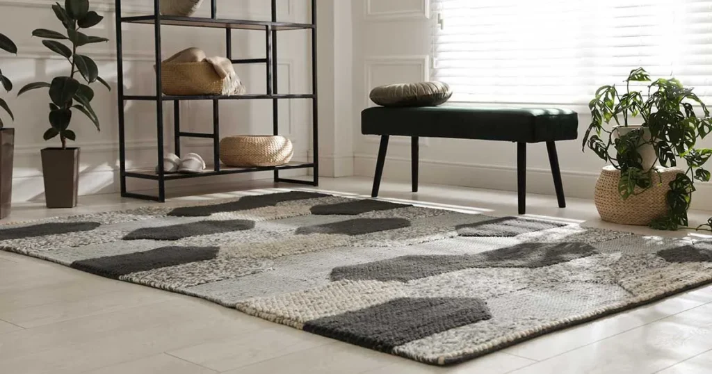
Gray carpet is one of the most versatile flooring choices available today. Its neutral base and wide range of undertones make it adaptable to virtually any décor style from ultra-modern minimalism to cozy farmhouse chic. Yet, the very neutrality that makes gray carpet so appealing can also pose a design challenge: selecting a wall color that both complements the carpet and brings your vision for the space to life.
In this comprehensive guide, we’ll explore 11 expertly curated wall-color options and key considerations to ensure the perfect match. Whether you’re aiming for an airy, light-filled room or a warm, enveloping retreat, you’ll find the inspiration and the practical know-how to choose the ideal paint shade for your gray-carpeted floors.
1. Understanding Your Gray Carpet’s Undertones
Before diving into paint swatches, pause to analyze your gray carpet’s undertones. Although all gray carpets fall under the “gray” umbrella, they can skew warm, cool, or neutral.
- Cool-Grays often have subtle hints of blue, green, or violet.
- Warm-Grays lean toward beige, taupe, or brown undertones.
- Neutral-Grays strike a balanced midpoint, neither distinctly warm nor cool.
Why It Matters:
Pairing a cool-toned paint with a warm-gray carpet (or vice versa) can create visual tension unless you’re deliberately seeking contrast. Matching undertones generally produces a harmonious, serene backdrop that makes furnishings and accents pop.
How to Check:
- Place a white sheet of paper next to your carpet in natural daylight.
- Observe whether the carpet appears slightly bluish (cool), beige (warm), or true gray (neutral).
- Jot down your carpet’s undertone before shopping for paint.
2. Crisp White Walls: The Ultimate Classic
Why White Works
- Timeless Appeal: White walls never go out of style.
- Amplifies Light: Reflects natural and artificial light, making rooms feel more spacious.
- Versatile Canvas: White provides a clean backdrop for colorful furnishings, artwork, or architectural details.
Choosing the Right White
- Cool Whites (blue-leaning) pair beautifully with cool-gray carpets.
- Warm Whites (yellow- or pink-tinged) complement warm-gray carpets, preventing the space from feeling sterile.
Designer Tip: Look for whites labeled “soft,” “cream,” or “off-white” if you want a cozier vibe. Pure bright whites (e.g., “High Reflectance White”) are best in ultra-modern, minimalist settings.
Styling Ideas
- Layer white walls with textured textiles—woven throws, velvet pillows—for visual warmth.
- Add play with black or dark-metal accents (picture frames, light fixtures) to ground the space.
3. Soft Beige and Taupe: Warmth Meets Neutrality
Why Beige/Taupe?
- Introduce warmth without overwhelming a neutral palette.
- Maintain a subdued, harmonious look that still feels inviting.
Shade Selection
- Light Beige: Ideal for small rooms or low-light spaces, keeps things bright yet warm.
- Greige (gray-beige): A trendy hybrid that complements both cool and warm grays.
- Classic Taupe: A richer, earthy option that adds depth.
Pro Tip: If your carpet is a cool-gray, choose a greige with subtle gray undertones. For warm-grays, lean into beiges with golden or caramel notes.
Design Pairings
- Wood Furniture: Warm woods (oak, maple) pop beautifully against beige walls.
- Natural Textures: Wicker baskets, jute rugs, and linen curtains boost the cozy factor.
4. Light Blue and Soft Teal: Serene & Refreshing
The Allure of Blue
- Evokes calmness and tranquility—perfect for bedrooms, bathrooms, or home offices.
- Offers a striking contrast to gray while remaining restorative.
Best Blue Hues
- Powder Blue: Subtle and airy, ideal for cool-gray carpets.
- Soft Teal or Aqua: Adds a hint of vibrancy without overpowering; works on greige carpets too.
Mood Note: Blues tend to make walls recede visually, making rooms feel larger and airier.
Complementary Accents
- White or Light Gray Trim: Keeps the look clean and crisp.
- Brass or Gold Hardware: Warms up the cool palette and adds a touch of luxury.
- Botanical Elements: Indoor plants thrive against blue backdrops, enhancing the spa-like ambiance.
5. Warm Greige and Mushroom: Modern Neutrals
What Is Greige?
A blend of gray and beige, greige walls strike a perfect balance—warm enough to feel cozy, cool enough to look contemporary.
Mushroom Tones
- A deeper, earthier version of greige, with additional brown or taupe undertones.
Why They Shine:
Greige and mushroom tones offer designer-approved sophistication. They blend seamlessly with gray carpets and provide a subdued backdrop that elevates modern furnishings.
Styling Suggestions
- Monochromatic Layering: Pair greige walls with slightly lighter or darker grays in upholstery and décor.
- Matte Finishes: Use matte or eggshell paint sheens to emphasize depth without glare.
6. Dusty Blush and Muted Pink: Soft Elegance
Embracing Pink
- Soft pinks are a bold yet surprisingly versatile choice.
- They inject warmth and subtle femininity, ideal for nurseries, bedrooms, or reading nooks.
Shade Guidelines
- Dusty Blush: Faint pink with gray undertones—works harmoniously with gray carpets.
- Muted Rose: Slightly deeper, reminiscent of vintage palettes.
Balance Tip: Complement pink walls with neutral furniture and metallic accents to prevent an overly saccharine look.
Décor Pairings
- White Trim & Molding: Maintains crisp lines and prevents pink from feeling overwhelming.
- Marble or Stone Accents: Counterbalance sweetness with natural textures.
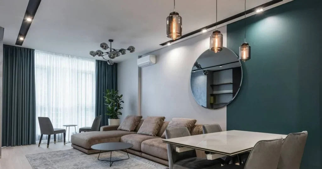
7. Charcoal and Deep Navy: Dramatic Contrast
Bold Accent Walls
- Create a dramatic focal point with a single wall painted in charcoal gray or deep navy.
- Works exceptionally well behind headboards, fireplaces, or media units.
Why It Works
- Provides depth and dimension without cluttering the room.
- Accents stand out—picture frames, shelves, and lighting fixtures become artful statements.
Placement Advice:
Limit dark hues to one or two walls to avoid making smaller rooms feel closed in. Balance with plenty of light-colored décor.
Accessorizing
- Light-Colored Furniture: Off-white or pale-gray sofas pop against the dark backdrop.
- Textured Accents: Velvet cushions, metallic side tables, or mirrored décor add richness.
8. Accent Wall Strategies & Patterns
Choosing a standout wall color is one thing—amplifying its impact is another. Accent walls can transform a room from ordinary to extraordinary.
- Geometric Paint Patterns
- Use painter’s tape to create chevrons, stripes, or triangles.
- Alternate between your main wall color and a complementary shade.
- Use painter’s tape to create chevrons, stripes, or triangles.
- Two-Tone Walls
- Split a wall horizontally: ceiling-to-midpoint in white, midpoint-to-floor in your accent color.
- Visually raises or lowers ceiling height depending on placement.
- Split a wall horizontally: ceiling-to-midpoint in white, midpoint-to-floor in your accent color.
- Color Blocking
- Paint three-quarters of the wall in one hue and a quarter in another (either bottom or top).
- Modern, high-contrast look that suits contemporary interiors.
- Paint three-quarters of the wall in one hue and a quarter in another (either bottom or top).
- Ombre Effects
- Gradually transition from light at the top to dark at the bottom (or vice versa).
- Creates a soothing, gradient backdrop.
- Gradually transition from light at the top to dark at the bottom (or vice versa).
Pro Installation Tip: Always use high-quality painter’s tape and a level; crisp lines are key to a polished finish.
9. Lighting & Paint Testing: Crucial Considerations
Even the most beautiful paint can look entirely different under various lighting conditions. Here’s how to ensure your chosen color remains true:
- Natural Light
- Observe swatches in morning, afternoon, and evening light.
- North-facing rooms receive cooler, indirect light; south-facing rooms are brighter and warmer.
- Observe swatches in morning, afternoon, and evening light.
- Artificial Light
- Warm LEDs cast yellowish tones—make cool-grays look more neutral.
- Cool LEDs emit bluish light—enhance blue undertones in both paint and carpet.
- Warm LEDs cast yellowish tones—make cool-grays look more neutral.
- Sample Boards
- Paint large swatches (at least 2’×2’) on poster board.
- Move boards around the room to mimic different wall placements.
- Paint large swatches (at least 2’×2’) on poster board.
- Time Test
- Live with samples for a week before committing; colors can shift subtly over time.
- Live with samples for a week before committing; colors can shift subtly over time.
Quick Fix: If your chosen color reads too cold or too warm, adjust by half a shade rather than switching entirely.
10. Additional Décor & Styling Tips
Complementing your wall and floor choices with the right furnishings and accessories will pull the entire room together.
- Layered Textiles: Mix and match rugs, throw pillows, and blankets in varied textures (wool, linen, faux fur).
- Artwork & Wall Décor: Hang pieces that incorporate both your carpet and wall colors to create cohesion.
- Window Treatments: Curtains in complementary hues (or sheer whites) can tie together walls and floors.
- Accent Furniture: A bold-colored chair or side table can serve as a delightful surprise amid neutrals.
- Metallic Accents: Brushed brass, copper, or matte black hardware lend polish and contrast.
11. Maintenance & Longevity
Selecting the perfect color is only half the battle—keeping it looking fresh is equally important.
- Washable Paint Finishes: Opt for satin or semi-gloss in high-traffic areas to allow easy wiping.
- Touch-Up Kits: Store leftover paint and a small brush for future nicks or stains.
- Avoid Direct Sunlight: UV rays can fade paint—use window films or treatments in sunny rooms.
Conclusion
Matching wall colors to a gray carpet doesn’t have to be daunting. By understanding your carpet’s undertones, testing samples, and choosing from a curated palette—ranging from crisp whites and warm taupes to serene blues and bold charcoals—you’ll create a space that feels cohesive, stylish, and distinctly yours.
Ready to transform your room? Grab those paint swatches, enlist a friend for swatch-hanging duty, and start experimenting. Your dream space, perfectly framed by gray carpet and a stunning wall hue, awaits!

Hi, I’m Ethan Matthews. As the Admin, I ensure our platform runs smoothly while curating the best content to keep your conversations exciting and entertaining.